

Monday, 15 November 2010
My passion for design still REIGNS within!
It is a time where recession is still hitting everyone everywhere, which includes me. I may not be working as a Part 2 Arch. Assistant, not because I stop, but to experience other opportunities which I may not ever experience next time. But the I am still involved with a design commision from back home which at least would not make my design skill go to rust. Anyways, desiging was becoming somewhat obsolete due to my current job until I saw the results for the World Architecture Festival, one of my favourite arch. firms, WOHA won the category for Completed Building Holiday, for Alila Villas Uluwatu which re-ignites my passion for design. For some reason, it reminded me of how much I used to like to create and present and make sure it gets recognised. Just had a quick look at my CV, its time to re-apply this bad boy.


Thursday, 15 July 2010
Pavilion Project - Final Sheet

 This is the only perspective render view I did for this project. Enjoy.
Wednesday, 14 July 2010
Design and Presentation development


 These are some of the picture renders I used for my final presentation sheet which will be uploaded soon. I have not uploaded the other renders because its I have forgotten to transfer it into my pendrive, as I am in the public library, the internet at home has been terrible. This is a competition called the Pavilion Project in Australia and the deadline is on the 16th.
Wednesday, 7 July 2010
Water as a Theme
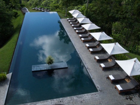 Water as a design theme or a focal entity in a concept has been lingering in my head ever since I saw a design by WOHA for a underground train station in Singapore which they exhibit and won at the World Architecture Festival 2009, Barcelona. This theme was shortly forgotten due to my busy schedule for my thesis, but my interest has been triggered again after uploading my previous post, swimming 55 stories up.
Water seems to provide a certain tranquility that reflects and beautify a space with a very simplistic manner. The Infinity Pool at Alila Ubud (above) is an award winning pool, similar to the pool in Skypark, it also stretches towards the virgin jungle, sinking your senses with the surrounding.
 This is a recent project design by WOHA, Alila Villas Uluwatu in Bali. It is an exquisite eco-resort design and this beautifully designed complex straddles a striking white limestone cliff and an arid savanna on the tropical island’s arid Bukit Pennisula. The Alilas Villas resort is the first of its kind to achieve the highest level of certification for Environmentally Sustainable Development (ESD) and is designed for the Green Globes GG21 standard. The take-your-breath-away beauty of the resort and its sensitive placement on the delicate landscape is enough to set one’s mind at ease. I will be designing a garden for my parents so this would be a very inspirational precedent. Water theme design does not have to be limited to just resorts. It can be used as an interface between two spaces. WOHA and Steven Holl had similar approach on different type of spaces.

 This is the Bras Basah MRT Station which help WOHA scooped building of the year in Barcelona and also a RIBA award. The water acts as a layering between the outside and underground, an interface yet the transparency creates a connection between spaces. It sits quietly like a public pond from ground level, but the water glass roof is a huge skylight for the underground.
 Steven Holl carpark design is similar in concept, different in material and context. The concrete roof is holding up a much deeper pond situated in front of the Nelson Atkins Museum of Art.
 Now, time to think of something more innovative, if only I could. <_<>
Sunday, 4 July 2010
Swimming In the Sky
 Would't it be interesting to be able to swim 55 storeys up? You would be able to do so in the infinity pool at Skypark that tops the Marina Bay Sands Hotel in Singapore. I remember looking at this project a few years ago of a perspective render on the interweb. The hotel itself did not do anything for me, but it was the horizontal deck on top that interlinks all 3 buildings together that intrigued my curiousity. Bold ideas like this gets people thinking and ponder. I hate heights but even this pool which is design to stretch towards the horizon, would give me the courage to sit at the edge and enjoy the wondrous panoramic cityscape view.


Monday, 28 June 2010
Design Concept - Pavilion Project
This is a competition to design a pavilion that will serve as an emergency shelter in areas that has been affected by natural disaster etc. We need to design a shelter that would be able to accomodate about 100m sq in size. The winner gets to see their prototype being build and exhibit in Australia in the next few months.
Yet again, simplicity is what I have in mind. But this time, I want to design a product. I do not want to just design an architectural structure, but a structure that is simple, adaptable and functional. It literally has the same principal as my Flexi Garden. Whether it will the interest needed is yet to be seen. I am doing this competition based on an impulse idea. I tried to developed it further, but I am not sure now if has become a reliant product. There is always that voice at the back of my head that says, it looks rubbish now.
Yet again, simplicity is what I have in mind. But this time, I want to design a product. I do not want to just design an architectural structure, but a structure that is simple, adaptable and functional. It literally has the same principal as my Flexi Garden. Whether it will the interest needed is yet to be seen. I am doing this competition based on an impulse idea. I tried to developed it further, but I am not sure now if has become a reliant product. There is always that voice at the back of my head that says, it looks rubbish now.

The shelter was designed to be portable, easy to be dismantled and put up without any aid from another person. [1] It started with a plank of wood, then both ends is fitted with holes for screws to interlock 2 planks together. [2] The middle section of the timber is fitted with metal to provide resistance againts bending. The upper bit is fixed with rubber guard to create resistance when wood or coconut leaves etc are placed on it for roofing. Detailed explanation will shown soon. [3] The metal is designed as a truss to create even more strength and resistance. [4] A coloured version of number 3. [5] The holes on the side for number 4 are created with a 45 degree angle interval, but it was changed to 30 degree interval.

This is the initial perspective on how it might look like. What worries me is that it looks like a 'breadstick' shelter. The planks are connected on the side, creating a shelter with ease by screwing nuts and bolt up.

These 2 are just a quick variant development work. I was trying to extend the space to allow more accomodation.
 [1] A shelter needs a steady foundation, hence the end plank is designed with a slight variant to its surface, a horizontal line cutting across its center to allow adjustment according to the landscape. [2] Showing the extra stability the end plank can provide. [3] As mention, I wanted to design this shelter pavilion as a product. In a group of 12, 10 normal planks with 2 end planks, it is easily carried around and its size can be judged with the feet by the product. With just 2 of these, a shelter can be build.
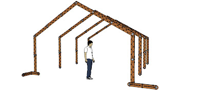
This is the next perspective view with the end plank supporting the structure. The end plank as you can see, can be bend or move horizontally to fit the situation. Obviously the joist is yet to be put on but it has been designed and will be uplaoded soon. The great thing about this, is that it can be extended as much as you like. It can be shaped in many ways but that would be shown next.
Saturday, 19 June 2010
Malaysia Pavilion at the Shanghai Expo 2010
The Shanghai Expo is something that interest me greatly, but knowing the cost of flight and accomodation would be high, I have decided to stay put, browse through the interweb and save up for other trips to come. Being a Malaysian, I would obviously try and support the design concept being put through for the Expo.

 My initial reaction was somewhat unpatriotic, "Ugh, the ugly one, yes, that would be the Malaysian Pavilion". I would not say that it is the worse of the bunch, but they are given the opportunity to create something conceptual that would boggles everyone's mind. I know the country likes to use culture and tradition as a basis of design, but that does not mean we need to limit the creativity of design. Go wild, open up abit, show the world that we are creative in different aspects, not limiting ourselves to just dance routines and traditional costume design.
My initial reaction was somewhat unpatriotic, "Ugh, the ugly one, yes, that would be the Malaysian Pavilion". I would not say that it is the worse of the bunch, but they are given the opportunity to create something conceptual that would boggles everyone's mind. I know the country likes to use culture and tradition as a basis of design, but that does not mean we need to limit the creativity of design. Go wild, open up abit, show the world that we are creative in different aspects, not limiting ourselves to just dance routines and traditional costume design.I am rubbish with local history, but there is even an arguement that this traditional house concept does not even belong to us. I am not going to debate about this, but if 80% of the forums say so, and 95% say its ugly, I would trust them. The numbers are based on my assumptions, as I could not see any positive comments, sorry. I am easily attracted to pretty pictures, and the only thing that interest me is how the roof would glow at night. It seems pretty transparent, looking based on the front entrance, the silhouette of the back roof can be seen. But as usual, they never seem to have a problem in disappointing you.

This is the Malaysian Pavilion once it is build. The 'extravagant' shiny transparent roof is no where to be seen, the exaggerated roof top has been lowered drastically and this pretty much depicts the same old traditional house which has a coloured pattern roof instead of zink or coconut leaves, with a red chimney attached. Very, very disappointing.

This is the Malaysian Pavilion once it is build. The 'extravagant' shiny transparent roof is no where to be seen, the exaggerated roof top has been lowered drastically and this pretty much depicts the same old traditional house which has a coloured pattern roof instead of zink or coconut leaves, with a red chimney attached. Very, very disappointing.
Our friendly neighbour, Singapore, however manage to come up with one of the most exciting pavilion that is being exhibit, in my opinion. Why can't our country be more daring in design? Is it not possible to have a competition to decide the designer for the expo? This way you would not only get the best possible concept design, but giving the young generations the chance to shine. No wonder we are moving away, thats right, you heard me.


The final product of a building should always look very similar to its rendered perspective, what you see is what you get. The UK pavilion is also the sexiest pavilion to be exhibit, with a 5 hours queue, it is 2nd most anticipated pavilion, behind the China pavilion, I think. The downside, however was the interior, apparently being to deep and abstract for visitors to understand. My trip to Tuileries has given me another simple perspective towards visitors, your product has to be simple to understand but yet mind boggling, something elementary but provides a big impact.

The Spain pavilion is one of my favourites. Instead of adopting their own culture as an inspiration, they look at Asian weaving as a design drive which led to the design of the facade. I thought Malaysia had weaving too? Anyways, this elegent building was also featured at the World Architecture Festival in Barcelona, 2009 and won an award.
I do hope the design merit in Malaysia will continue to grow, and we the younger generations do have the potential and talent to shine, and that is perfectly shown when students from Malaysia has won the 2010 Evolo Skyscraper International Design Competition. I do not know any other architects apart from Ken Yeang being known globally, but that I believe this will change and it starts now.
Monday, 14 June 2010
Jardins Jardin - Other Shortlisters
 1] This design is pretty decent, stacking up pots in a very efficient manner. It suits very well in a domestic surrounding.
 2] This project, apparently got alot of attention during the private viewing. They mention about this getting to commercialised, how soon? I do not know, I was not present when the designers came with people who are interested.
 3] This project belongs to a product designer, and its literally a watering can, just smaller and cuter. It caught quite a lot of attention than what I would have predicted. This is where I started to understand that, public are more interested with design approach that concentrates on a smaller scale, rather than how I approach my way of designing a garden.
 4] This is a bench, it is unstable and it didnt get alot of attention in comparison with the others, I feel. This paritcular project did not do anything for me.
 5] Quite a number of people like this project, including my dad. Its a hanging garden for the interior, but the design gives the client a few problems to deal with. There is always a possibility of it falling, and with kids who like to jump and climb, this would become a target. Maintenance is also hard, depending how high the thing goes, and it needs a gardener who is patient enough to spray the plants with water and not use a hose to drown it. Elegent but not practical.
 6] This is a design prototype that caught alot of attention as well. The design is at its initial stages, but it is a garden box that would be capable of providing plants its natural habitual surrounding. Well, not literally but, it can control temperature, humidity, ventilation and mist, hence any type of plants around the world can be sustain in that box. The designer is trying to gather all the plants information, so it could be programmed and the box can suit to the plants habitual property with a click of a button. This guy is an engineer, hence the approach is different to the others.
 7] This girl is a product designer. It is suppose to be a box, situated by the kitchen to help you grow spices such as basil etc. The first thing that came to mind when I saw this was, it would grow sprouts, hence cottons.
8] This product also belongs to another product designer. The concept behind it is pretty interesting. It is a cone, that is filled with seeds and it is meant to be put in cracks around the city to allow green vegetation. The great thing about the product is it is capable of being dismantle once the seeds show some growth, which can be seen in the sequence below the poster.
 9] The approach is similar to mine but without the flexibility. I couldnt read French, but I could assume how the lines came about. The was a rake, which you could see on the left, raking the city, creating new breed of greenery to brighten up the area and as a gathering spot. It can also be added to create a continuous wave.
 10] This was design by 2 architect students from Italy. It is a waiting garden box that is fitted at a side carpark. The area is elevated to prevent direct contact with pollution from the car exhaust.
 11] This approach is very similar to the engineer's design at a bigger scale and simpler, it is a paradise box during winter, and it can be put anywhere in the city. The design in my opinion however is not sustainable, practical and it would be expensive.
 12] I had a similar approach to this when I first tried coming up with concept for this competition. The designer was not there, so I could only assume its a shed with some plants in it.
 13] This idea is for plants to be hang with ropes then left stranded outside. It may provide a quick fix for a broken facade, but what if a strong breeze comes along? Guess.
 14] This pot got a number of interest as well. Its not just a pot for plants, but it is a recycable pot made out of recycled papers. It can be put in side a house and if becomes to big, just put the pot with the plants into the soil and it will start to degrade. Very environmentally friendly.
 15] This is a design approach that tries to provide a garden for each household in flat and at the same time, bring greenery and colour to a broken facade. It is a steel frame expose structure and creates a balcony with plants for extra space.
 16] I do not know much about this apart from it being a plants carpet. Wouldnt you need to wash your feet after stepping on those? Just a note.
 17] I couldnt tell this was design by an architect. It is a recycable machine, but instead of exhanging recycable products with cash, you are given vegetables. You literally put in a can rather then coins into the vending machine and vegetable would drop out. Interesting idea.
18] This is called the green pimple. It does not seem to do much for me as well. It looks like a structure that tries to be a shed, but apparently can be put onto walls which I find weird because the design and compatibility does not seem to fit that criteria.
There were suppsoe to be 18 shortlisted including me but it seems to be 18 here already. Will need to get my booklet to see who is the extra exhibitor. Will update once I find that booklet.
Subscribe to:
Posts (Atom)